Graphic design for a Domy vypráví exhibition at the Museum of Litoměřice
Scope
Exhibition Design
Client
Muzeum Litoměřice
Year
2025
Industry
Culture

Exhibition visual identity: Magdalena Gurská, Tereza Matěchová
Design: Sofiia Markova, Ondřej Skořepa
Architecture: studio Richard Loskot
Photos of the exhibition: ČTK
Context
Žatec and the Landscape of Saaz Hops represent a unique agro-industrial system that earned UNESCO World Heritage status in 2023. The challenge was to create a visual bridge between a centuries-old agricultural legacy and a forward-looking institutional identity, avoiding the predictable tropes associated with the hop industry.
Approach
The design is built around custom organic shapes representing hop shoots, symbolizing the continuous growth and vitality of the Žatec region. We intentionally avoided the cliché of using a hop-cone (hop head) in the logo—a symbol used by nearly every other entity in the sector. Instead, we used organic forms to express what hops really represent: nature, growth, and Czechia’s “green gold.” The arrow became our symbol of movement — representing the constant flow of people, workers, tourists, and export that define this living landscape. To signal that this heritage is not stuck in the past, we bypassed traditional serif fonts in favor of Yellix, a modern sans-serif by the Czech Display Type Foundry. This choice, combined with minimalist graphic elements, creates a clean, rhythmic, and functional system.
Outcome
The identity presents Žatec with confidence and clarity, honoring its ancient heritage while firmly positioning it for the future. By replacing literal symbols with abstract organic forms and contemporary typography, the platform communicates intelligence and trust. The result is a unique visual language that distinguishes the UNESCO site as a modern strategic partner rather than just a historic monument.
Credits
Creative Direction & Design 21+21 studio (Sofiia Markova & Ondřej Skořepa) Typography Yellix by Display Type Foundry


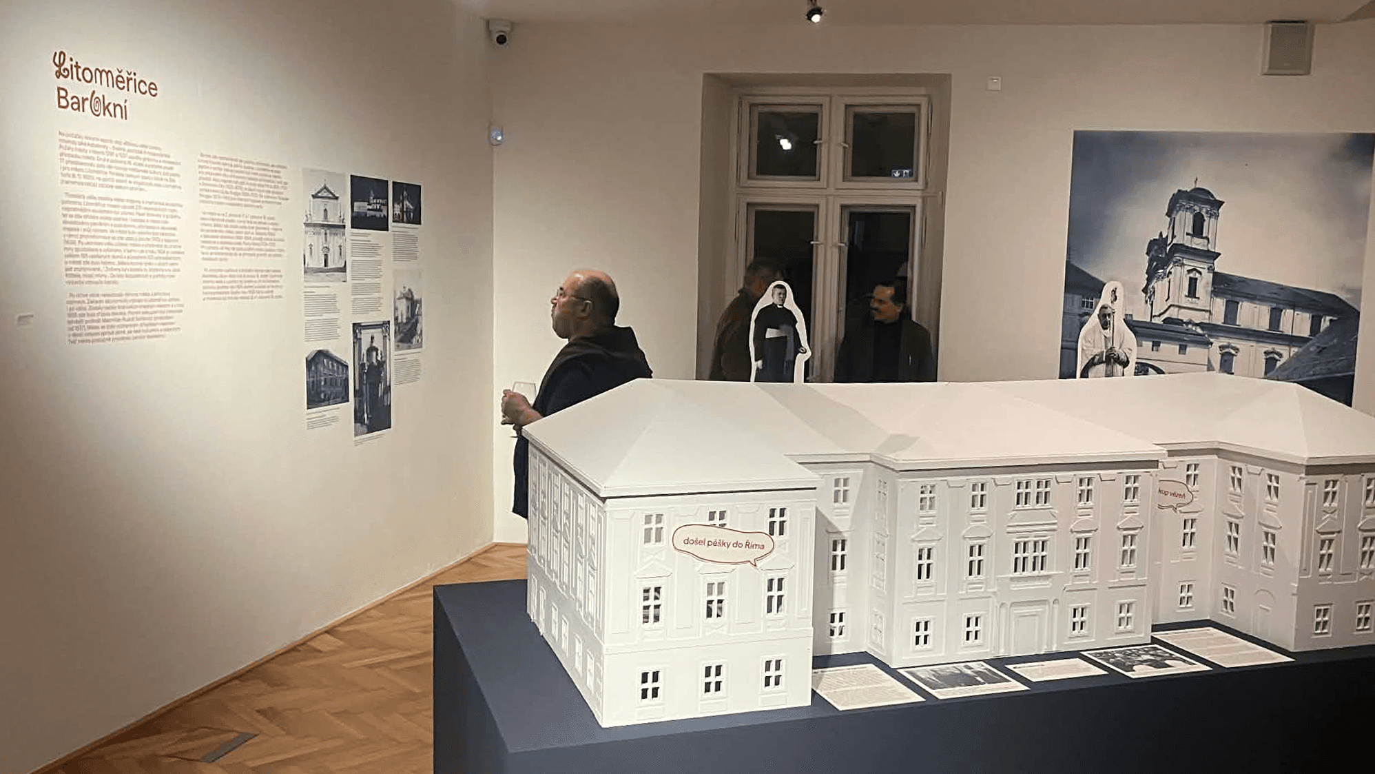


Graphic design for a Domy vypráví exhibition at the Museum of Litoměřice
Scope
Exhibition Design
Client
Muzeum Litoměřice
Year
2025
Industry
Culture
Exhibition visual identity: Magdalena Gurská, Tereza Matěchová
Design: Sofiia Markova, Ondřej Skořepa
Architecture: studio Richard Loskot
Photos of the exhibition: ČTK
Context
Žatec and the Landscape of Saaz Hops represent a unique agro-industrial system that earned UNESCO World Heritage status in 2023. The challenge was to create a visual bridge between a centuries-old agricultural legacy and a forward-looking institutional identity, avoiding the predictable tropes associated with the hop industry.
Approach
The design is built around custom organic shapes representing hop shoots, symbolizing the continuous growth and vitality of the Žatec region. We intentionally avoided the cliché of using a hop-cone (hop head) in the logo—a symbol used by nearly every other entity in the sector. Instead, we used organic forms to express what hops really represent: nature, growth, and Czechia’s “green gold.” The arrow became our symbol of movement — representing the constant flow of people, workers, tourists, and export that define this living landscape. To signal that this heritage is not stuck in the past, we bypassed traditional serif fonts in favor of Yellix, a modern sans-serif by the Czech Display Type Foundry. This choice, combined with minimalist graphic elements, creates a clean, rhythmic, and functional system.
Outcome
The identity presents Žatec with confidence and clarity, honoring its ancient heritage while firmly positioning it for the future. By replacing literal symbols with abstract organic forms and contemporary typography, the platform communicates intelligence and trust. The result is a unique visual language that distinguishes the UNESCO site as a modern strategic partner rather than just a historic monument.
Credits
Creative Direction & Design 21+21 studio (Sofiia Markova & Ondřej Skořepa) Typography Yellix by Display Type Foundry
Graphic design for a Domy vypráví exhibition at the Museum of Litoměřice
Scope
Exhibition Design
Client
Muzeum Litoměřice
Year
2025
Industry
Culture
Exhibition visual identity: Magdalena Gurská, Tereza Matěchová
Design: Sofiia Markova, Ondřej Skořepa
Architecture: studio Richard Loskot
Photos of the exhibition: ČTK
Context
Žatec and the Landscape of Saaz Hops represent a unique agro-industrial system that earned UNESCO World Heritage status in 2023. The challenge was to create a visual bridge between a centuries-old agricultural legacy and a forward-looking institutional identity, avoiding the predictable tropes associated with the hop industry.
Approach
The design is built around custom organic shapes representing hop shoots, symbolizing the continuous growth and vitality of the Žatec region. We intentionally avoided the cliché of using a hop-cone (hop head) in the logo—a symbol used by nearly every other entity in the sector. Instead, we used organic forms to express what hops really represent: nature, growth, and Czechia’s “green gold.” The arrow became our symbol of movement — representing the constant flow of people, workers, tourists, and export that define this living landscape. To signal that this heritage is not stuck in the past, we bypassed traditional serif fonts in favor of Yellix, a modern sans-serif by the Czech Display Type Foundry. This choice, combined with minimalist graphic elements, creates a clean, rhythmic, and functional system.
Outcome
The identity presents Žatec with confidence and clarity, honoring its ancient heritage while firmly positioning it for the future. By replacing literal symbols with abstract organic forms and contemporary typography, the platform communicates intelligence and trust. The result is a unique visual language that distinguishes the UNESCO site as a modern strategic partner rather than just a historic monument.
Credits
Creative Direction & Design 21+21 studio (Sofiia Markova & Ondřej Skořepa) Typography Yellix by Display Type Foundry